About a 6-minute read
A Facebook cover can combine several photos, a short message, or a full brand design. The name "cover photo" doesn't mean the banner has to be one plain photograph.
Client photo credits: Verse Chocolate (chocolate photos) and Stellar Real Estate Co. (team portraits).
These five cover concepts use product photos and portraits from my brand photography archive. The Verse Chocolate covers use Verse's own logo and cream color. The Media concepts use Media's current type and colors. Each shows a different way to put photos, words, and brand details together.
Start with what you want someone to understand about your business. Then choose the images and words that help make that clear.
If you need upload dimensions and crop checks, use the Facebook cover photo size guide.
In this post
A product photo collage
Hommey's documented cover uses related bedding photos in side-by-side panels. Each panel adds a different color or view while staying part of one product story.
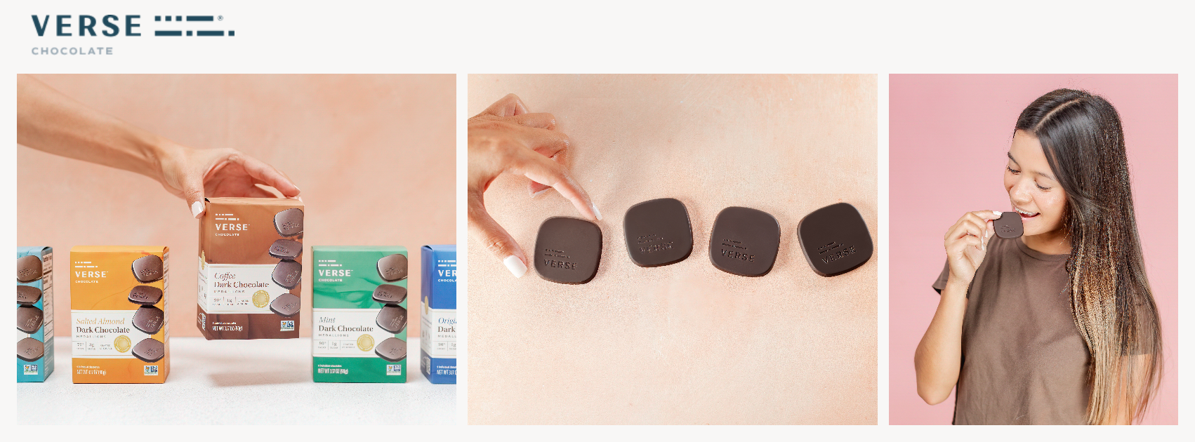
I used that idea to build this original product collage. The three panels show the Verse package, unwrapped chocolate, and someone enjoying it.
Each photo adds something to the same subject. The first helps you spot the package. The second shows what is inside. The third shows the product in use.
I'd consider this direction for a product business with several useful views to share. Keep the panels related through the product, setting, light, or photo style. The number of panels is a layout choice, rather than a rule for every cover.
A message beside two photos
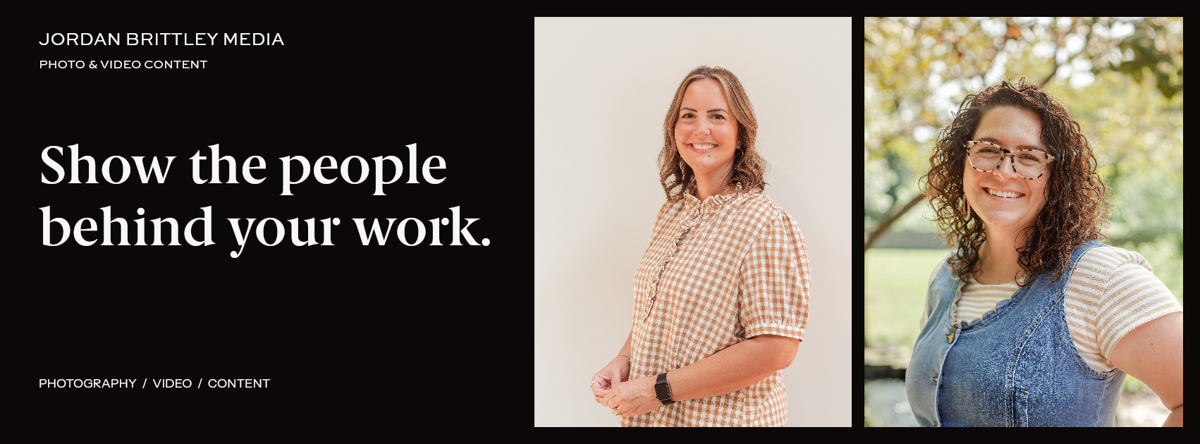
The second concept puts the words on an opaque dark panel and the photos beside it. The message reads, "Show the people behind your work."
The panel gives the type its own space. The photos keep their original color, and there is no need to darken them to make the words readable.
I'd consider this layout when a new visitor needs a short explanation of the business as well as a view of the work. Use one message for the main text. Keep the full service list and other details in the Page information.
Choose photos that help explain the words. A product business could pair its main product with a view of it in use. A service business could pair a portrait with work in progress.
A collage with a centered message
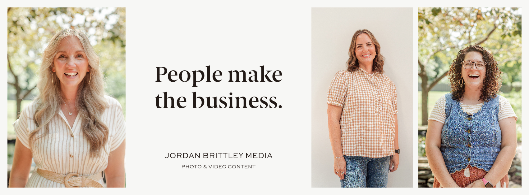
The third concept places a light text panel between portrait panels. The message becomes a point to read between the photos.
I'd try this when the cover needs both a short statement and several views. The open space around the type keeps it separate from the photos.
Keep the message short enough to fit without shrinking it. If the words need another paragraph to make sense, move that detail into a post or your Page information.
Check each photograph on its own too. A layout can look balanced while cutting through a face or hiding a key product detail. Scale the photo in proportion, then adjust the crop or choose another frame.
The portrait panels in this concept use different widths. That is a design choice for this set. Equal panels may suit another set better.
A product photo with a clear brand mark
United By Blue's documented cover pairs an ocean photograph with a short mission statement. The image and the words support the same subject.
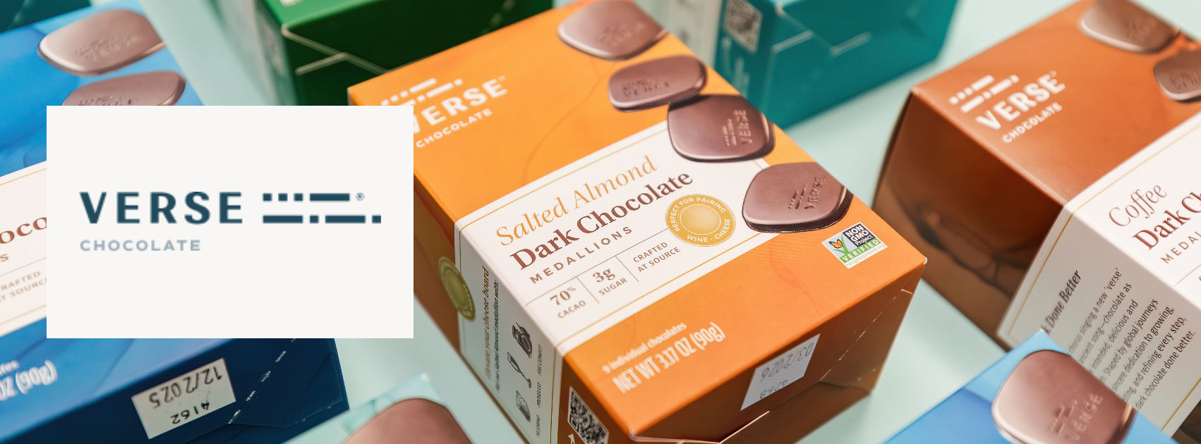
That shared focus shaped this Verse concept. A product photo fills the cover, while Verse's own logo sits on a warm cream panel. The main package remains visible beside the logo.
The panel gives the brand mark a clear surface. The photo keeps its original color. Both parts of the cover point to Verse Chocolate.
I'd consider this structure when one photo can carry the product story. Use the featured brand's logo and colors. A short brand message can also work here, if the photo supports it and the words stay readable.
A type-led brand cover
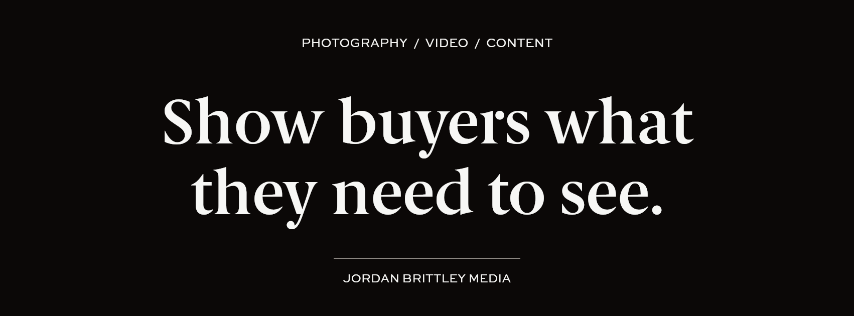
The fifth concept uses Media's existing message, "Show buyers what they need to see," with the current brand typefaces and dark palette.
I'd consider a type-led cover when the message carries the purpose of the banner. A launch, a named offer, or a short brand statement may need words more than it needs another photo.
Let the main line be the first thing someone reads. Use smaller text for support, and check it at the actual display size. A line that looks clear in a large design file can become too small on a phone.
Keep the colors and type tied to the brand. The cover should fit beside the profile picture and the rest of the Page.
Choose the layout around the business question
| What you want to show | A layout I'd consider | What to check |
|---|---|---|
| Several product views | A related-photo collage | Each panel adds useful information |
| A short explanation of the business | A message beside photos | The photos support the words |
| Several views and one main statement | A collage with a text panel | The message stays readable |
| A product and its brand | A photo with a clear brand mark | The package and logo remain clear |
| A launch or brand message | A type-led cover | The words make sense at a glance |
These concepts show layout options. They have not been tested as live Facebook covers, so I wouldn't call one a proven winner.
What the real brand examples show
During the research, I reviewed covers documented by Shopify and Buffer.
Hommey's example uses related bedding photos in a strip. United By Blue pairs a photograph with mission copy. Sand Cloud combines a seasonal scene and headline. Buffer uses a graphic announcement, and Vera Bradley lets a brand pattern carry the cover.
Those examples helped frame the layout choices in this guide. The concepts shown here use my own photos and original layouts. Brand details follow the business featured in each design.
The research did not establish that one layout performs best across businesses. Results from multi-image feed posts or carousel ads answer a different question from Page-cover design.
Keep the photos related
A collage can show more than one part of a business. Choose photos that belong to the same offer, collection, or story.
Look at the light, background, and framing across the set. The images can differ, but they should help someone understand the same business.
I've also shared an earlier photo-collage workflow for business covers. It shows how images can be paired. For a new cover, choose the layout around the business question before choosing the tool.
Review the uploaded cover
Check the final design on a phone and a computer. Look at it beside the profile picture and Page details.
- Keep the main message readable.
- Check faces, products, and key details for awkward cuts.
- Give each collage panel a clear purpose.
- Use the brand's approved type, colors, and artwork.
- Keep current offers and Page details in sync.
- Review the crop after uploading.