About a 6-minute read
To use a trend in your brand, choose one detail that fits your business and give it a clear place to go. Keep the colors, message, and product details your customers already know.
For this set, I explored doe print in a laptop pouch, tissue paper, and a napkin ribbon. Each use gives the pattern a different job. The business gets to decide how much of that pattern belongs in its world.
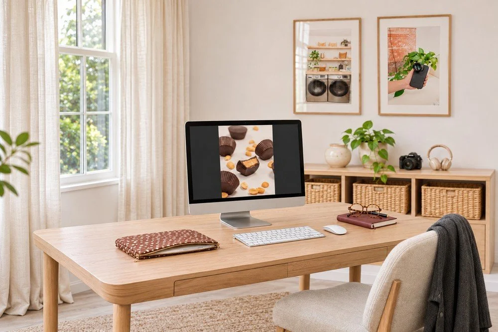
Start with the brand you already have
Before choosing a print, put it beside your current colors, logo, and product. Look at them together at the size a customer will see.
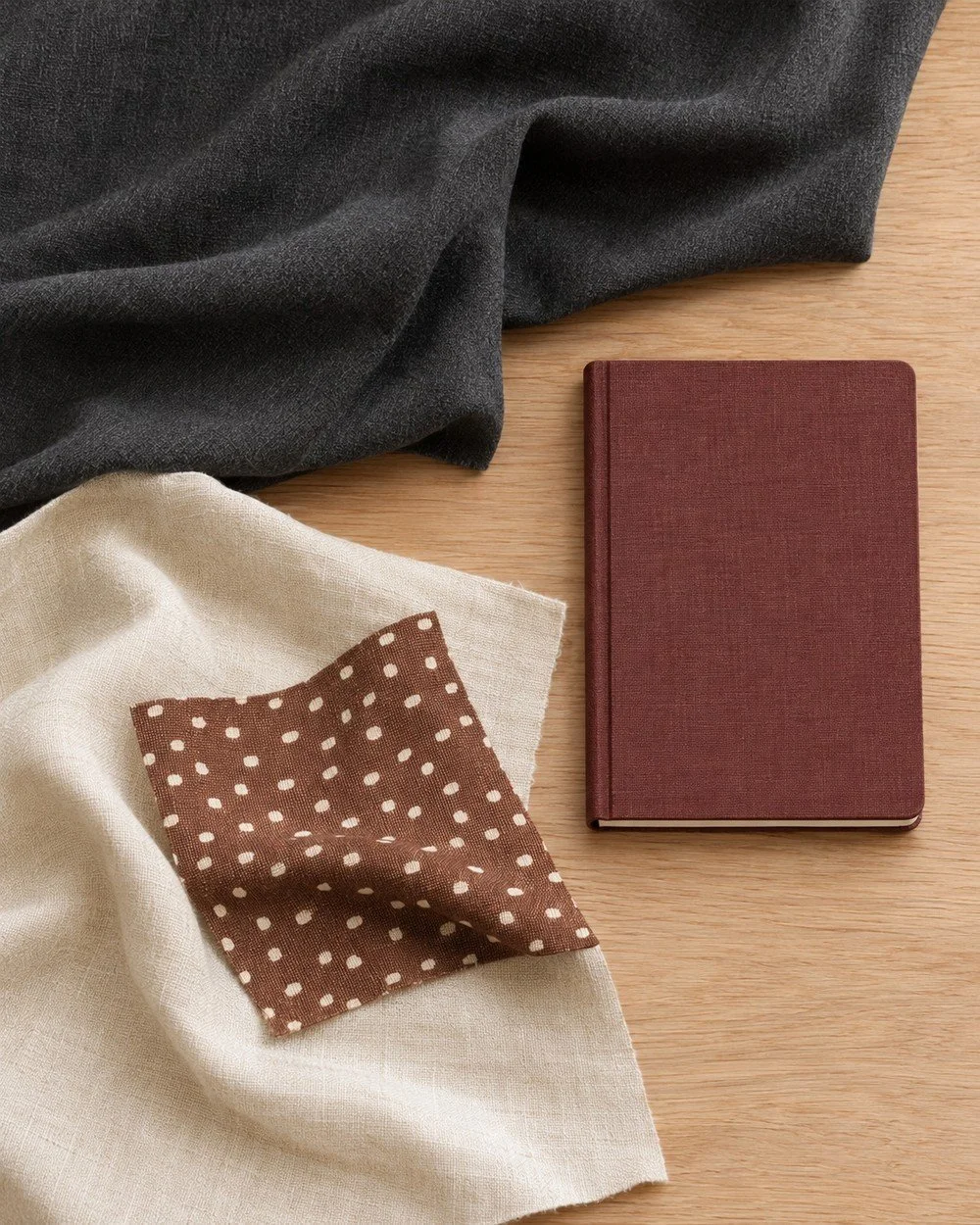
Brand identity includes your imagery and voice, along with your colors and type. That gives you several things to keep familiar while you try a new detail.
In this direction, the chestnut and ivory print sits beside cream, charcoal, and oxblood. The plain fabrics give the spots space. The notebook keeps its solid cover.
For your brand, check the fit before choosing the item:
- Do these colors belong beside what you sell?
- Does the pattern suit the mood of your business?
- Can customers still read the name and key details?
If you want other prints to compare, start with these brand pattern ideas.
Give the trend one clear job
A print can belong in one part of a campaign. Choose that part based on what your customer needs to see or experience.
A work accessory for a service business
The doe-print pouch gives the office one patterned detail. The desk, framed work, and other materials keep their own style.
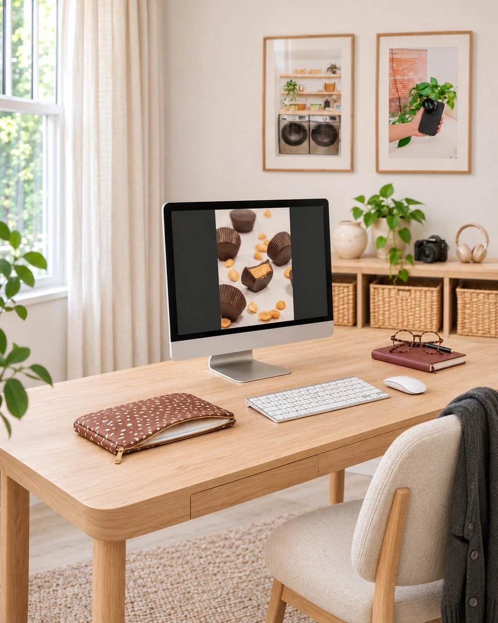
I’d consider this for a service business that shares its workday. A bag, pouch, or notebook cover could bring a trend into those photos while the work remains clear.
Choose an item you would use. Then decide what the photo needs to say about the business around it.
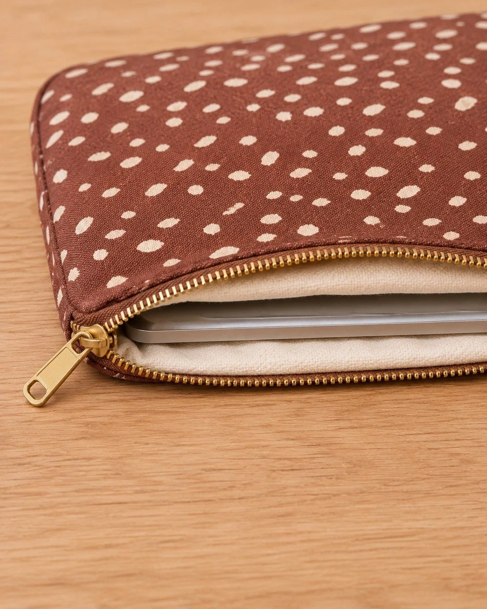
Show how the accessory works
For a pouch, the close view needs to show the opening, lining and fit. A customer should be able to see how the laptop sits inside it. Keep those useful details in the brief alongside the pattern and colors.
Tissue paper for a product brand
The black box and cream top keep their plain colors. Doe-print tissue adds the pattern inside the package.
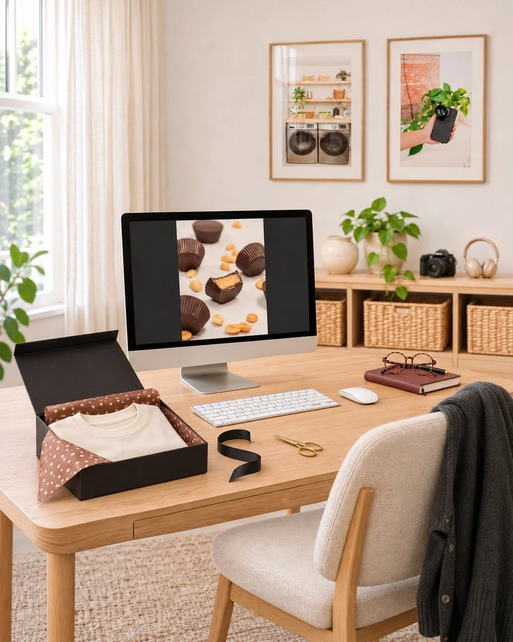
This is a place I’d explore when a brand wants a seasonal detail it can change with its next order of packing materials. Check a sample with the actual product and box before committing to a large batch.
Keep the order clear in the photo. Customers should be able to tell what they receive and which details belong to the wrapping.
Show what belongs to the wrapping
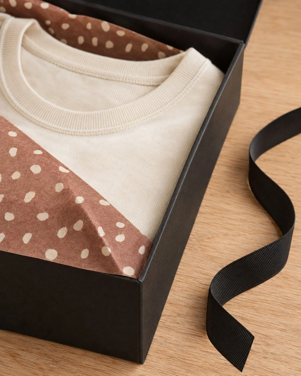
The close view shows where the tissue folds around the top and meets the box. Use a detail like this to explain the packing idea. Keep the actual product separate in your description so customers know which part they are buying.
Ribbon for an event business
The place setting uses doe print on one ribbon around a blush napkin. The plate and flowers stay plain.
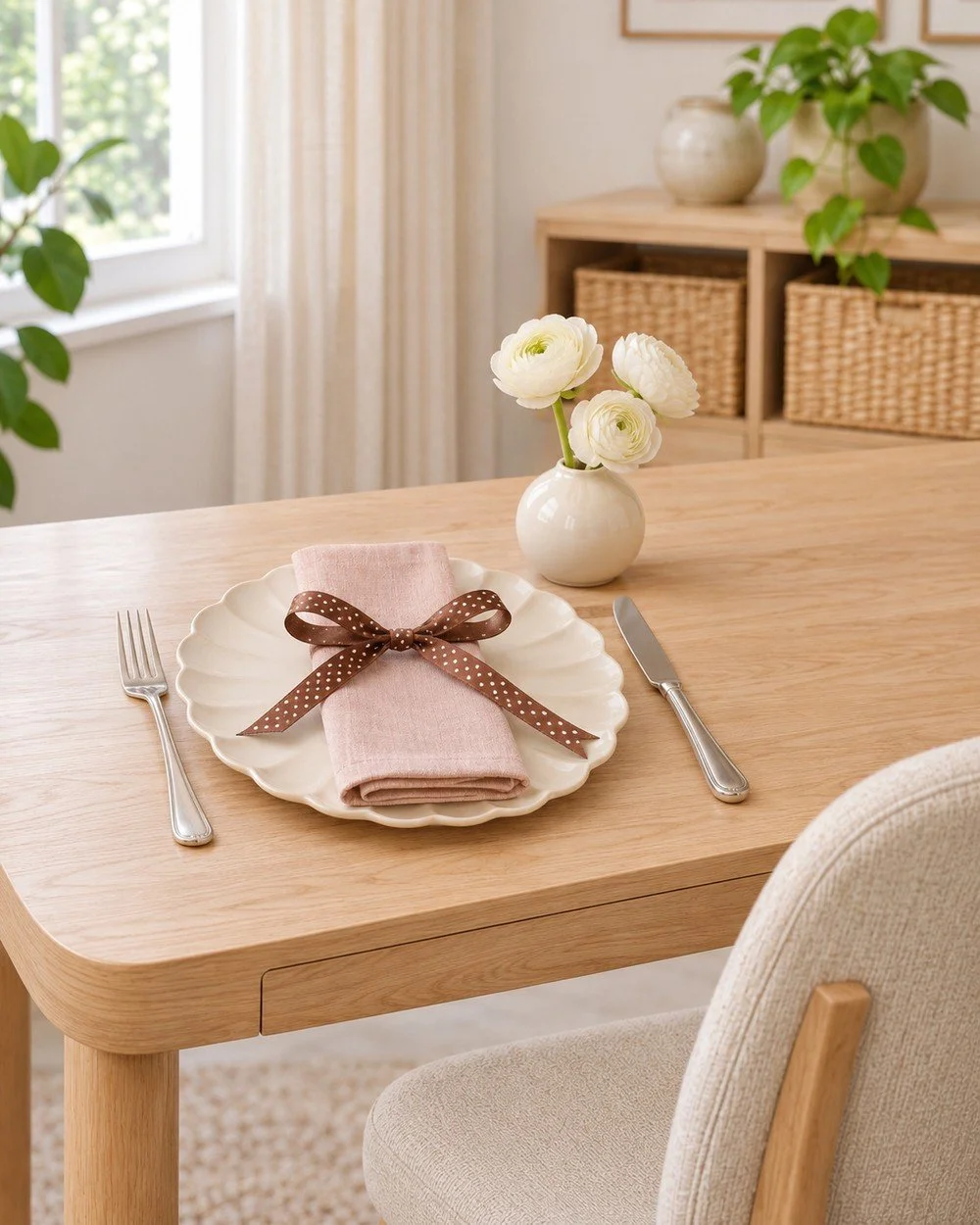
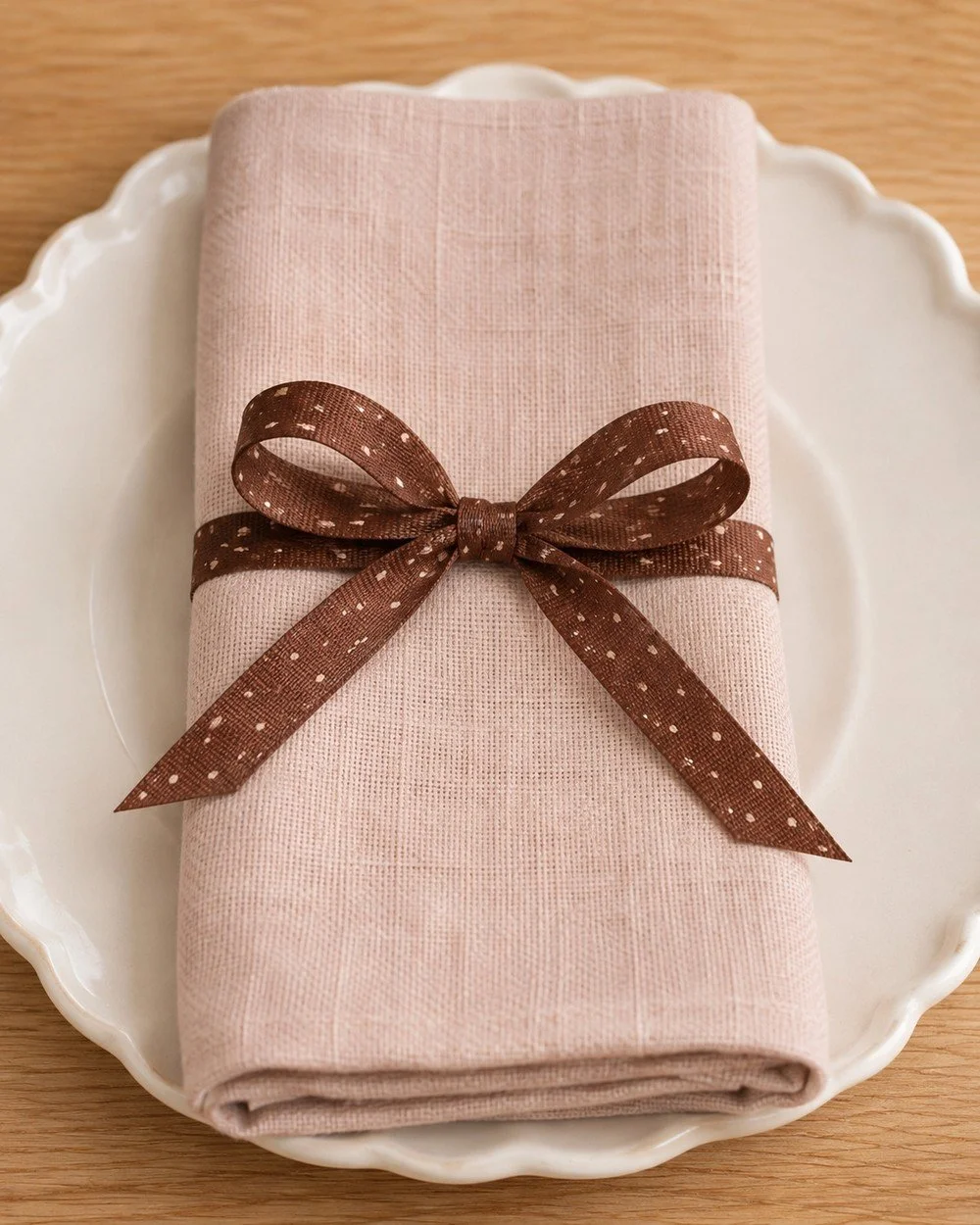
An event business could use a sample like this to help a client choose a detail. The full view shows how it sits with the rest of the setting. The close view helps them judge the ribbon beside the linen.
Choose the pattern with the full event palette in view. That includes the flowers, paper pieces, and other fabrics planned for the day.
Check the ribbon beside the linen
A close view lets you compare the spot size, ribbon width and napkin fabric. Check the bow as part of the full place setting, too. If it is a client sample, describe it as a proposed detail until the final materials are chosen.
Choose how long the detail needs to last
Before adding a trend, decide when you expect to review it again.
Tissue for a seasonal order, a ribbon for one event, and a pattern printed across permanent packaging call for different commitments. Check the number of items, the cost to replace them, and where the detail will appear.
For a short campaign, I’d start with a piece you can change at the end of that campaign. Your logo and core colors can keep doing their usual work.
Our seasonal product photo examples show how one palette can carry through several settings when you are planning a wider set.
Review the whole campaign before you share it
Look at the photos beside your website, email, and recent posts. Reviewing those pieces against your brand guidelines helps you spot choices that drift from your usual style.
Check what leads each image. The product should stay clear in a product post. An event sample should help someone picture the setting. A work accessory should support the business you are showing.
Give the wide view and the close detail different jobs. You can use one to introduce the idea and the other to explain a detail worth seeing.
Questions about using trends in your brand
Does every trend need a place in my brand?
Choose the ones that fit your customers, offer, and style. You can leave a trend out when it adds little to the message you need to share.
Can a service business use a visual trend?
Yes. A work accessory or a detail in a planned photo set can give the trend a place. Keep the service and the work clear in the finished content.
Should I change my brand colors to match a trend?
Try the trend beside your current colors first. Decide whether the pairing fits before changing a part of the brand that appears across many materials.
How much pattern should I use?
Start with one item so you can judge the full design. Check whether the name, product, and message remain clear at the final size.
How do I decide whether to keep it?
Review the use you chose and what happened after you shared it. Customer questions and the inquiries your content brings can help you decide what to repeat or change.
For your next campaign, finish this short brief:
We want to try this trend on ____. It fits our brand because ____. Keep our current ____ clear. We’ll use it for ____ and review it after ____.