Choose a website banner photo that works on mobile
A website banner photo needs to keep its main subject clear on a phone as well as a wide screen. Choose it by checking what stays in view, where the headline sits, and whether the crop still says what you meant.
I would make that choice inside the page layout. A photo can be strong on its own and lose the detail that made it useful when the page shows only a narrow part of it.
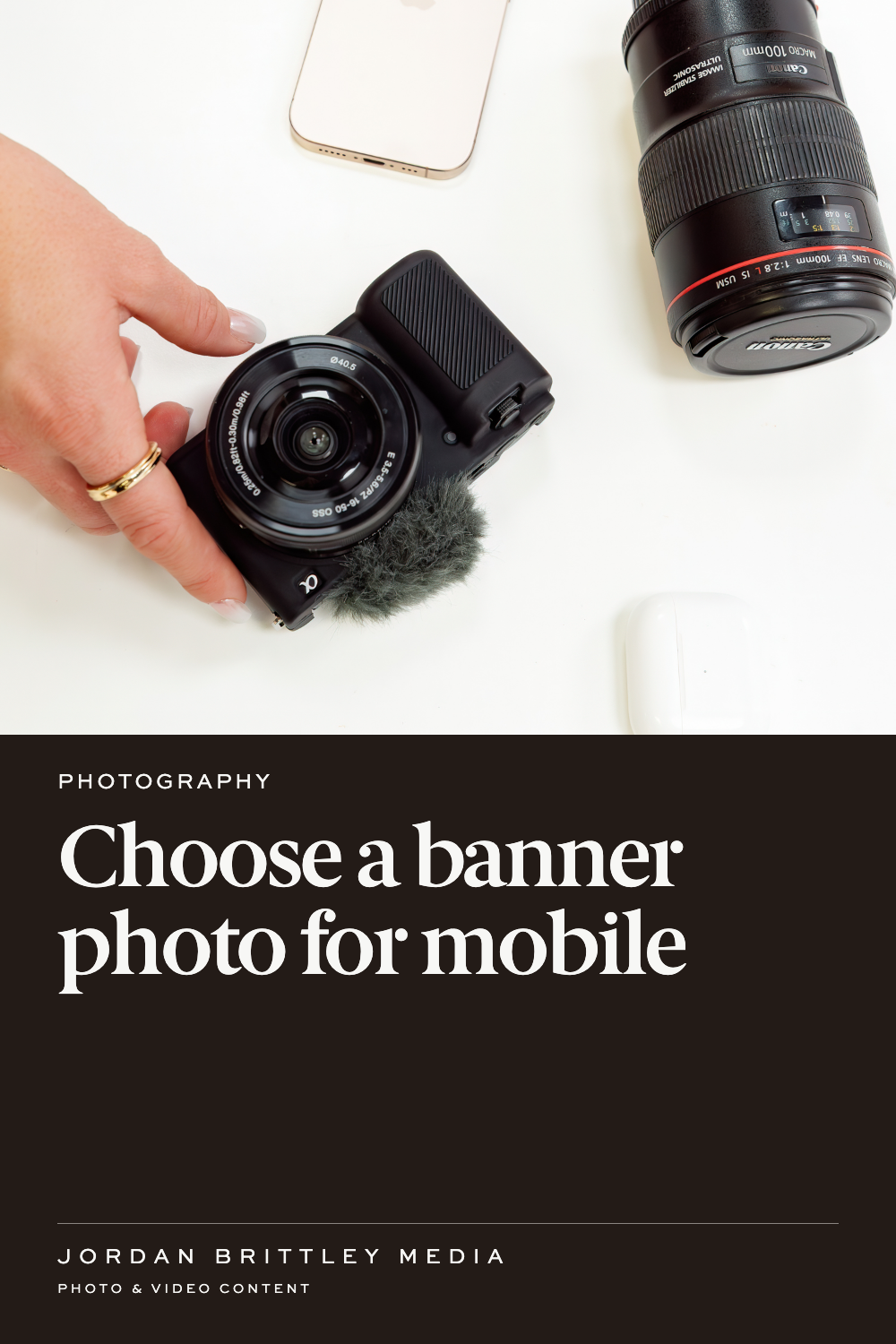
Name the part the crop must keep
Before you compare photos, finish this sentence: “A reader needs to see ___ to understand this section.” The answer might be the full product, a hand using it, or the space where a service happens.
Be specific. If you sell a bag, a wide photo may show its size next to a person. A narrow crop that keeps only the fabric loses that size cue. If the section is about the fabric itself, that same detail may work well. The page's message decides which view fits.
Mark the essential part for your web designer. A note such as “keep the handle and the full top opening in view” gives more direction than “please make this look good.”
Expect the frame to change
The shape of a banner can change as the screen gets narrower. The space taken by the headline can change too. That means the page may show less of the photo, even when the original file has plenty of detail.
Squarespace's crop guidance explains that banner height and browser width affect the crop. A focal point changes how the image is centered. It does not add space that the original photo never had.
I would compare a few photos with room around the subject. Look for one where the essential detail stays together, rather than stretching from one edge of the frame to the other. Keep a second option when the wide page and the phone view need different compositions.
Give the words their own space
Check the actual headline, not a short stand-in. A longer line can sit over a face, product label, or hand. A button can cover the detail that explains the offer.
Try the page with the words you plan to keep. Check these three things:
- The headline is readable against that part of the photo.
- The subject is clear without needing the hidden edges.
- The button does not cover the detail readers need.
If the words and photo keep competing for the same space, ask your designer about a different layout. Putting text beside an image may serve the page better than forcing it over the photo.
Check meaning, not only sharpness
A crisp crop can still tell the wrong story. In a hypothetical product banner, three jars may represent three options. If the mobile crop shows only one, the headline “Choose your set” may no longer make sense.
Look at the narrow view without recalling the full image. Can you tell what is being shown? Does the product look complete? Is a person cut in a way that pulls attention from the message? Does the photo still match the nearby words?
Give your designer the problem you see and the detail you want to keep. That lets them decide whether a new crop, another image, or a layout change will solve it.
Plan for people who cannot see the banner
Keep key facts in the page text. A price, product name, or service promise should not live only inside a photo.
Ask your designer how the image is treated for people using a screen reader. The W3C image guidance distinguishes images that carry information from those that are decorative. The right text alternative depends on the image's job.
Send one clear note with the selected photo
Here is a sample handoff: “This is the banner for our bag collection. Keep the full bag and handle visible. The headline is ‘Carry what your day needs.’ Please check the phone view with that exact headline before we approve the page.”
For a new brand photo project, share the page layout before the shoot. Bring the wide view, the phone view, and the words that need to fit. Those details help the team plan photos for the space they must fill.
Questions about banner photos
Will a larger image fix the crop?
A larger file may help with sharpness. It will not change which part fits inside a narrow frame.
Should every banner use a centered subject?
No. Choose the composition around the message and text placement. Test the image in the actual layout.
Can one photo work on both screens?
It can, when the main subject and text have enough space. Check both views before deciding.
What if the mobile crop hides the product?
Ask the designer to try another crop, image, or layout. Do not approve a view that hides the point of the section.
What should I bring to a shoot planning call?
Bring the page layout, headline, and a note naming the detail each banner must show. If you need new images, share those pages with the project brief.