About a 7-minute read
Holiday product photography can bring a seasonal feel to your campaign while keeping your product easy to recognize. In this holiday kitchen concept, burgundy cloth and cedar sit beside a pantry jar with an olive label. Cream and walnut carry the warmer tones through the gallery.
I like giving the colors a clear job, then changing what each photo helps a buyer see. The full jar introduces the product. A close detail shows the tallow. The gift box gives the same jar a holiday setting. That leaves your team with several useful views of one product.
In this post
- A holiday product photography palette built around the label
- Let the foreground photo introduce the product
- Give buyers a closer look at the texture
- Use the gift close-up to show a holiday setting
- Add a person when the photo needs to show use
- Put the image uses in your brief
- Questions about this holiday product gallery
A holiday product photography palette built around the label
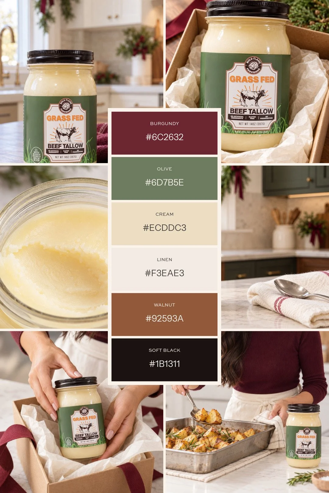
The green label and pale tallow give this gallery its starting colors. Burgundy brings the holiday accent into the towel and ribbon. Walnut adds warmth beneath the glass, while the black lid keeps a small dark detail in the set.
Here are the six swatches pulled from the finished photos. They are visual references for this gallery; light and material change how each shade appears.
| Color | Hex | Role in this gallery |
|---|---|---|
| Burgundy | #6C2632 | Towel, ribbon and holiday accents |
| Olive | #6D7B5E | Product label and greenery |
| Tallow cream | #ECDDC3 | Pale product and warm light tones |
| Warm linen | #F3EAE3 | Tissue and soft pale surfaces |
| Walnut | #92593A | Countertop and warm supporting surfaces |
| Soft black | #1B1311 | Jar lid and small dark details |
For your own campaign, share the current packaging with your photographer before choosing the supporting colors. A label, a bottle or the product itself may already carry the color the whole set can follow. Keep the product your customer receives as the reference.
The product-shoot prep guide covers the samples and packaging details to send ahead.
Let the foreground photo introduce the product
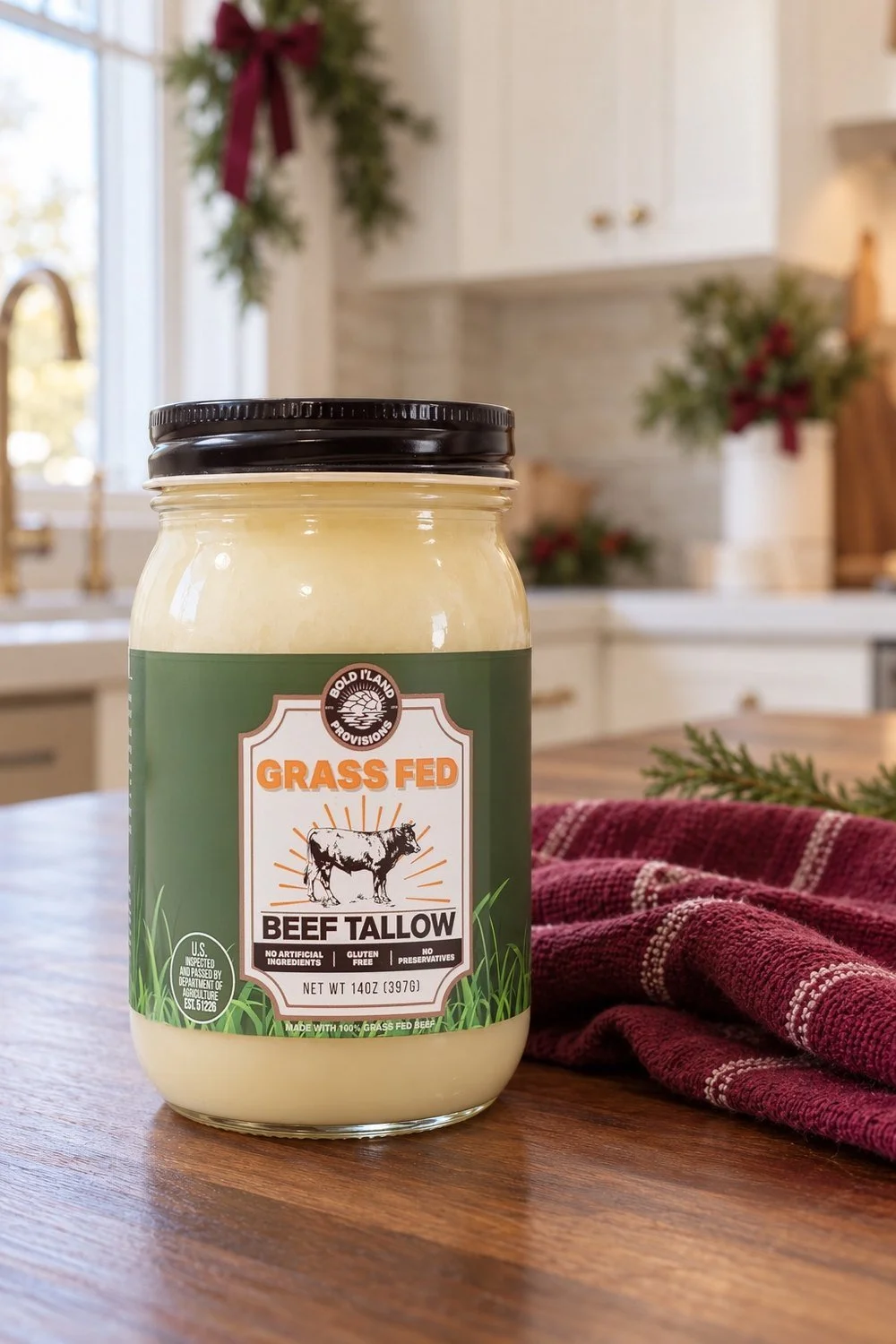
The foreground view puts the complete jar close to the camera. You can see the lid, the label and the pale tallow through the glass. The towel and greenery carry the holiday colors into the space around it.
This gives a seasonal email or collection page a clear product-led image. The scene has context, and the jar still holds your attention.
I’d review that photo at the size your team plans to use. A label that reads in a large gallery may be harder to see in a small email block. Share the planned placement with your photographer so the framing serves the actual page.
The wider kitchen view gives the product space beside a towel and spoon. That can support a wider page layout when the final crop keeps the jar complete. Our lifestyle product photography guide looks more closely at keeping the item for sale clear within a scene.
Give buyers a closer look at the texture
The open-jar detail changes the question the photo answers. It brings the pale tallow and the scoop mark close enough to see their surface. The label sits outside this tight crop because the product texture is the point of this image.
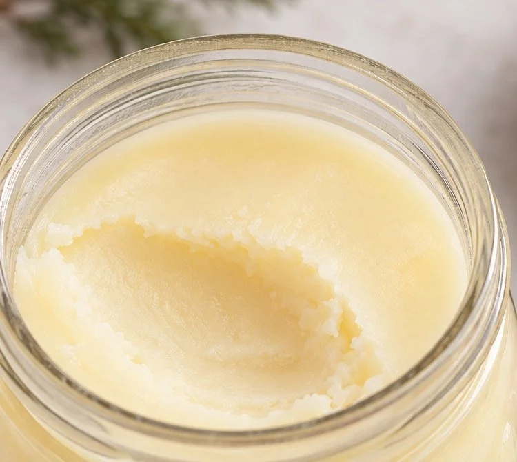
Use it beside the clear full-jar view so buyers can connect the detail to the package. A close-up supports the set when it reveals something the wider photo cannot show at that size.
Etsy’s guide to product photo types makes a useful distinction between lifestyle, detail and packaging views. Each carries different information. That is the reason I’d ask for varied product coverage in the same brief.
Use the gift close-up to show a holiday setting
The gift view carries the same colors into a small kraft box. Cream tissue supports the jar. Burgundy ribbon and cedar bring the holiday detail close to the product.
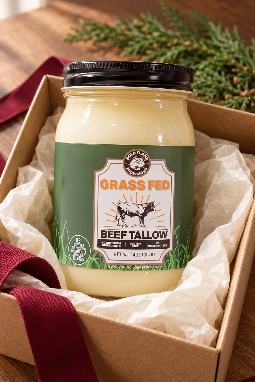
This is a styling concept, so the box should only stand for a gift option if that is an offer your business actually sells. Share the real box, included items and wrap with your photographer when planning a gift campaign. The image and the written offer should describe the same thing.
A gift photo can lead a gift-guide feature or a seasonal email. Keep the label visible and give the packaging enough room to make sense at the chosen crop.
For another use of color across a product gallery, see the fall seasonal product photo feature. That set follows an amber candle through different settings; this gallery stays close to the jar, its contents and its holiday packaging.
Add a person when the photo needs to show use
The jar photos above keep people out of the frame, and the product still carries each scene. Some products make more sense when the photo shows someone using them. In this SprinJene bathroom concept, a model in red plaid pajamas leans on the vanity while the toothpaste tube rests in the foreground. She brings a daily routine into the scene, and the tube stays closest to the camera.
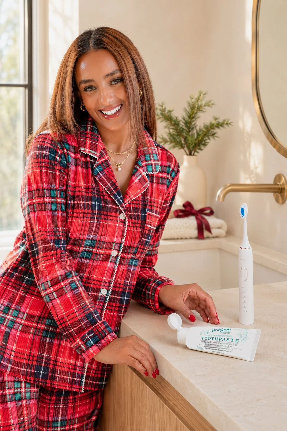
The teal label sets the color story for this set. Red plaid, a burgundy ribbon and cream towels bring in the holiday feel. The olive, walnut and soft black swatches above come from the jar gallery.
Keep the label readable when a hand enters the frame
A hand resting beside the product gives the photo a sense of scale. In this close view, the fingers stay behind the tube, so the teal SprinJene label reads clearly in front of them. Plan a view like this when buyers need to recognize the package in an email or on a product page.
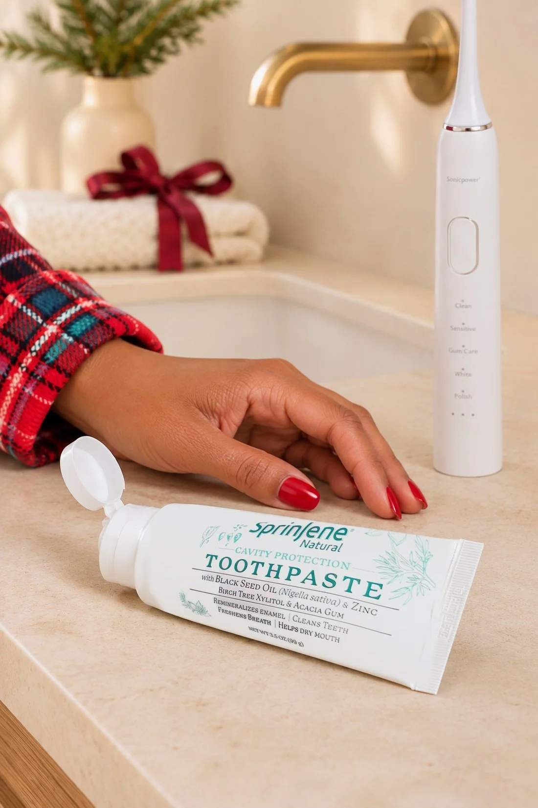
Show the product in use
The brushing photo shows the routine itself. The tube stays on the counter in the foreground, so the image still leads back to the product. A use photo like this can open a social post or a seasonal email, with the clear product view nearby for a closer look.
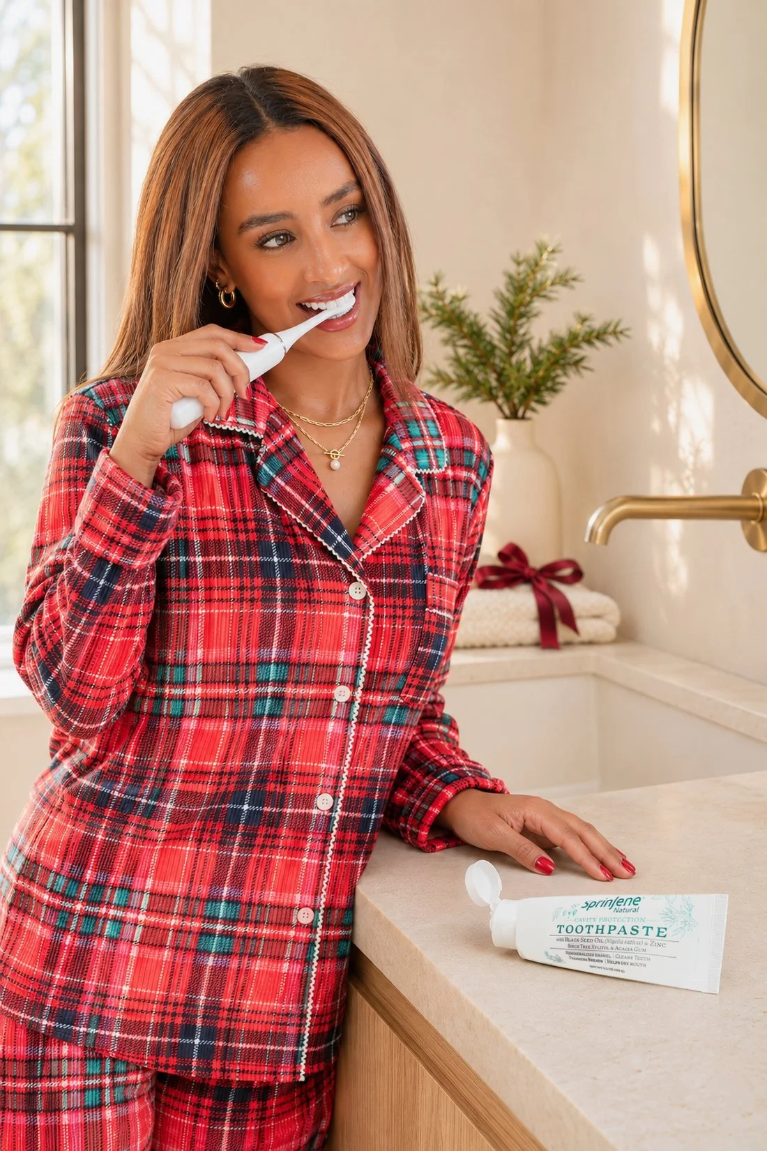
If a person belongs in your campaign, list that role in the brief next to the product views you still need.
Put the image uses in your brief
Before you send a brief, name the places these photos need to work: a product page, a holiday email, a gift guide or social posts. Include the real product and packaging with that list.
Keep campaign images and required listing images as separate entries. For example, Google Merchant Center’s image requirements prohibit promotional overlays on the main product image. A seasonal campaign photo still needs to fit the rules of the place where you use it.
A brief for a gallery like this could read:
Create a holiday product set using our current packaging as the color reference. Carry burgundy, olive, cream and walnut through fitting materials. Include one full product view, one close texture detail, one gift view based on our real offer, and one wider scene. Keep the product’s size and label clear. We’ll share the planned website, email and social uses before the shoot.
For the wider campaign list and first-use dates, the holiday brand photo planning guide covers those decisions.
Questions about this holiday product gallery
Which colors carry the holiday feel?
Burgundy cloth, ribbon and cedar carry the holiday cues in this gallery. The olive label, pale tallow and walnut counter connect those accents to the product.
Should every photo show the whole product?
A full view helps buyers recognize the package. A tight detail can then show the texture or finish, with the full view nearby for context.
Does every product photo need a model?
This close-up set keeps people outside the frame. The jar, towel, spoon and gift box give the product useful context on their own. Add a person when the photo needs to show how the product is used, as in the SprinJene example above.
Can these hex codes be used as exact product colors?
Use them as a gallery reference. The samples come from photos, so they are not a print specification or a measured packaging color standard.
What should go in the photo brief first?
Start with the product your customer receives and where the finished photos will appear. Add the real packaging, the campaign dates and the details each image needs to show.